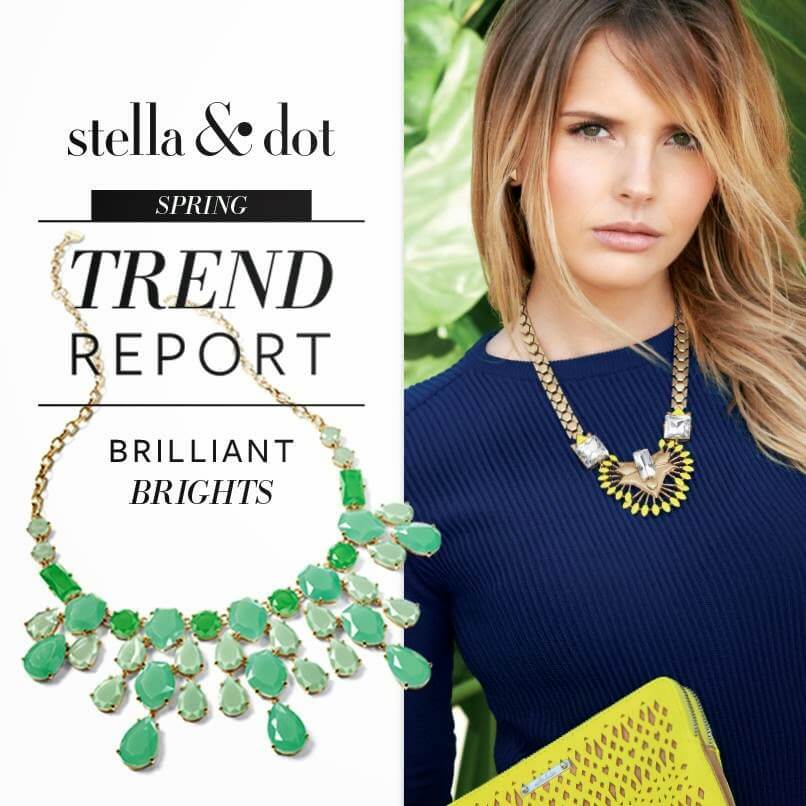
This post will focus on the trend of BRILLIANT BRIGHTS.
Nothing says spring like some bold, bright colors. This trend can be easily incorporated now, in winter, and carry you through to spring.
I love this blurb on Pantone's site regarding color trends for spring 2014.....
Three very adaptable pastels sit on one end of the palette, and, because we are so accustomed to seeing them as nature's background, they can be creatively combined with any other color in the spectrum. Placid Blue, like a picture-perfect, tranquil and reassuring sky, induces a sense of peaceful calmness, while Violet Tulip, a romantic, vintage purple, evokes wistful nostalgia. Similar to the verdant shade of springtime foliage, Hemlock, a summery, ornamental green, provides a decorative touch that's very different from the greens of recent seasons. Pair any of these versatile pastels with a bolder hue for an au courant look.Sand, a lightly toasted and amiable neutral, conjures images of the beach and the carefree days of summer. Try pairing Sand with Hemlock for perfect, natural balance. Paloma serves as a quintessential neutral, interesting enough to be worn alone or combined with any color for sophisticated poise.Cayenne, a high-pitched red, adds a dash of spicy heat to neutrals, and heightens the excitement when mixed with Freesia, a blazing yellow that is sure to illuminate wardrobes this season. A tropical, floral-inspired shade, Freesia's warmth and energy help set the stage for Celosia Orange, an optimistic, spontaneous hue. Pair Celosia Orange with Violet Tulip for a captivating vision, much like the setting summer sun.The palette is brought full circle with Radiant Orchid, a bold counterpart to Violet Tulip, andDazzling Blue,a scintillating, polar opposite to Placid Blue. Surprisingly, these strong, vibrant colors also pair well across the palette: They are perfect companions to pastels, and add confidence and vivacity when mixed with other bold colors.
And this little video explains the trend as well...
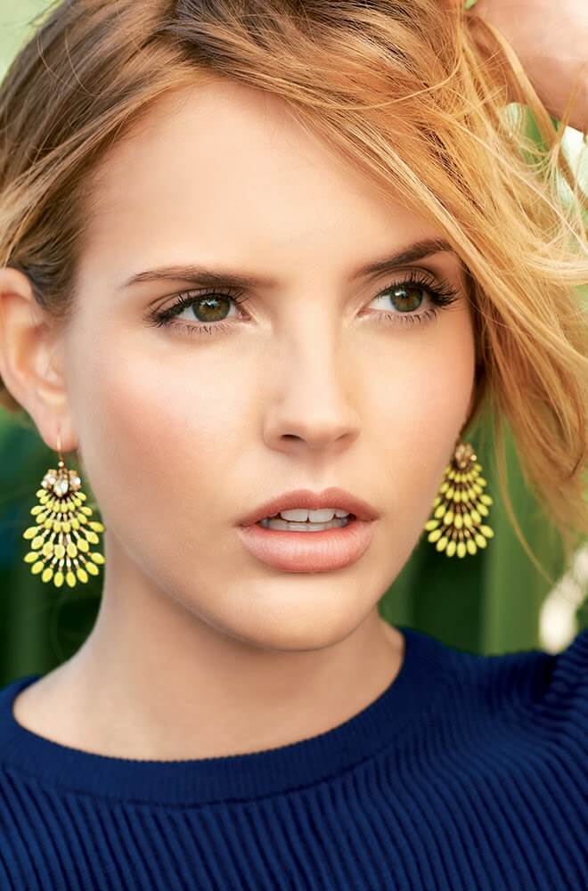
So, here are some examples.....
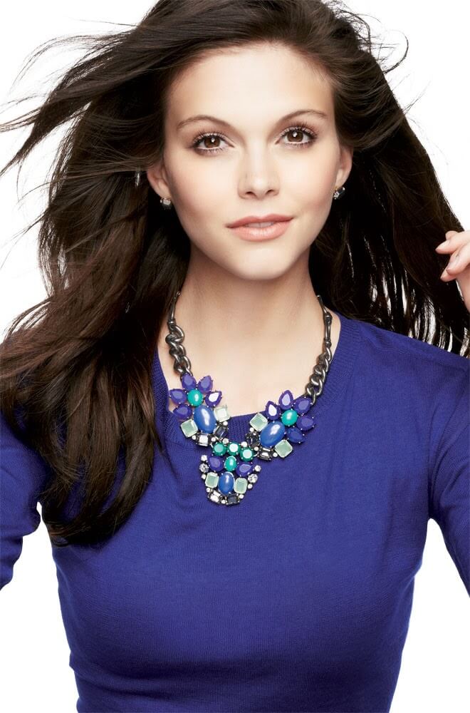
Cobalt
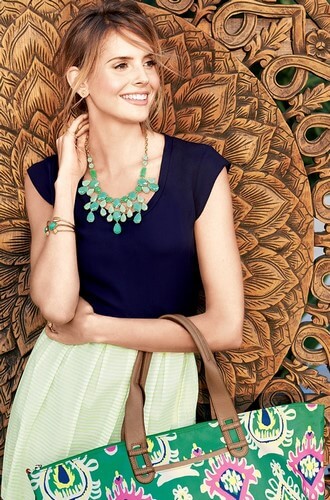
Greens....
Red...

Citrine...
You can see all of these pieces & more HERE
Which color will you be trying out!?!
1 comment:
Awesome post.Thanks For share this post wit us.The urge to boost our physical look with Boho jewelry is unchanged. each doable a part of our body is adorned with jewellery, be it ear rings for the ears, anklets String Bracelet ankles or neckpieces for the necks.
Post a Comment